 A VETERAN OWNED SMALL BUSINESS |
5 Signage Decisions That Can Affect a Business’s First Impression
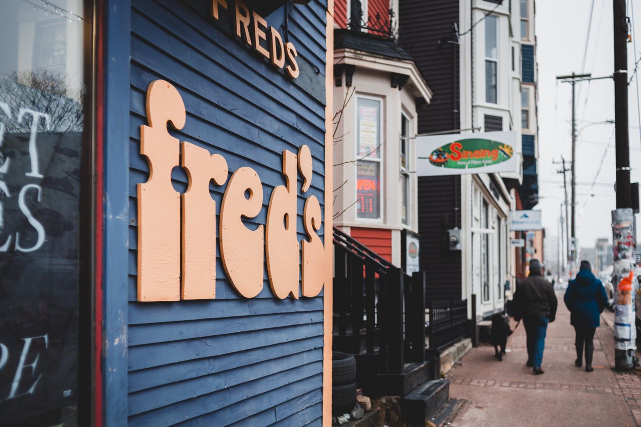
A customer may form an opinion about a business before speaking to anyone, looking at a menu, or walking through the front door. Often, the first clue is the sign.
A clean, readable sign can make a business feel established and easy to approach. A faded sign, crowded design, or poorly placed logo can do the opposite. This is especially important in a busy city such as Los Angeles, where businesses compete for attention from people walking, driving, and passing through crowded commercial areas.
The numbers support the idea that signage deserves more thought. Research from the Sign Research Foundation found that 61% of shoppers had failed to find a business because its sign was too small or unclear. The same research found that 33% had been drawn into an unfamiliar store because of the quality of its sign.
Here are five decisions that can shape that first impression.
1. Choosing the Right Size
A sign can look great on a computer screen and still be difficult to read from the street. Size should be based on where the sign will be viewed from. A storefront beside a busy road may need larger lettering than a sign inside a small office building. The viewing distance, traffic speed, surrounding buildings, and position of the sign can all affect how easily people can read it.
This is one reason a site survey can be useful before a design is finalized. Looking at the actual location helps determine whether the proposed sign will be large enough and placed where people can see it. The goal is simple: customers should not have to work to figure out what business they are looking at.
2. Keeping the Message Easy to Read
A business sign has a limited amount of time to communicate. Using too many words, decorative fonts, or several competing design elements can make the message harder to understand. Strong contrast between the lettering and background can help, while simple typefaces are often easier to read from a distance.
This does not mean every sign needs to look plain. A business can still use its colors, logo, lighting, and design style. The key is making sure those elements support the main message instead of getting in its way. In practice, good signage often feels simple because the important information is easy to find.
3. Matching the Sign to the Business
A sign also tells people what kind of experience they might have inside. A modern technology company may want clean dimensional lettering. A restaurant might choose illuminated signage or a more expressive storefront design. A professional office may prefer something quieter and more refined.
The sign should feel connected to the business rather than looking like an unrelated object attached to the building.
This is where custom design can be useful. Instead of starting with a standard template, businesses can consider their logo, colors, building, audience, and the way people approach the property. Different materials also create different impressions. Metal, acrylic, neon, dimensional letters, and backlit signs each give a space a different feel.
4. Considering the Local Setting
Location can have a major effect on signage. A business in a busy part of Los Angeles may need to compete with traffic, other storefronts, large buildings, trees, street lighting, and plenty of visual clutter.
From what we’ve seen, that is why designers working on custom signs Los Angeles often needs to match the graphics to the actual setting instead of simply choosing a style that looks attractive in isolation. Los Angeles Sign Company, for example, starts some projects with a site survey to assess the location, visibility, and mounting needs before recommending a sign solution.
The local setting can also affect permits and installation requirements. A sign that works well in one area may need different planning in another. Generally, having experience with what works in a particular location can be extremely valuable. A designer who understands the surroundings can make choices that help the sign stand out without making it look out of place.
5. Planning for Maintenance and Longevity
The first impression does not end after installation. A sign that looked sharp when it was new can gradually become faded, dirty, damaged, or poorly lit. When that happens, customers may still see the sign every day, but the message being sent is different.
Materials and construction therefore deserve attention from the beginning. Outdoor signs have to deal with sun, rain, wind, and regular exposure to the elements. Lighting also needs to be maintained if the sign is illuminated.
Regular maintenance can help keep the original design looking the way it was intended. For businesses with older signs, restoration may also be an option instead of replacing everything. The right choice depends on the condition of the sign, its materials, and the image the business wants to maintain.
The Bottom Line
A business sign has a practical job, but it also becomes part of how people remember the company. It identifies the location, communicates the brand, and can influence whether someone feels comfortable walking inside. That makes the decisions behind the sign worth considering carefully. Size, readability, design, location, and maintenance all contribute to what customers see before they experience the business itself.
A strong first impression does not require the biggest or flashiest sign on the street. It requires a sign that fits the business, can be understood quickly, and looks like it belongs exactly where it has been placed.








 Business Programs

Leave a Reply
Want to join the discussion?Feel free to contribute!